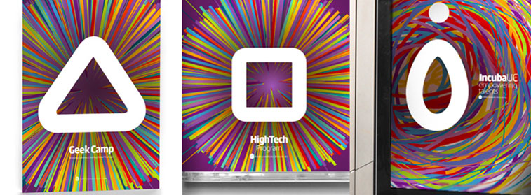
This is the Visual Identity System created to identify the business incubator of the Catholic University of Chile, composed by three brands.
The present work is part of a systematic guide programmed to display a coherent and meaningful whole for the institution. The system was thought for being launched at one time, but it can be applied in a process according of what the entity deems appropriate.

Beyond the general system, each brand of the branches was designed to promote particular accents chords to the specific topic of its scope, but always in tune with each other, as the final objective is to promote the assembly and use synergies among brands in order to position the core of the institution.
All brands project strong and attractive symbols that refer to technology, as well as pushing the viewer toward a centre. Their colours are the accurate for digital media, as it uses a rich an dynamic chromatic palette, attractive to eyes. In the axis of the marks, the lightness of the multiple lines contrasts with synthetic futuristic icons.
The design proposal for the IncubaUC brand (the head of the organization) looks the association of the entity with a nest and the egg with the letter i of the name as literal message. The two remaining brands have basic shapes. Geek Camp, that is the big event of IncubaUC, is a triangle, which awakens from its pyramidal shape the feeling of upliftment and growth. High Tech Program meanwhile, is referenced in a square, with the materiality and stability of the symbol, according to the semiotic approach.

