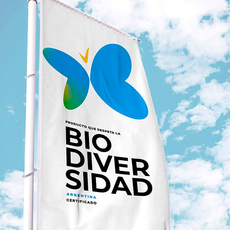
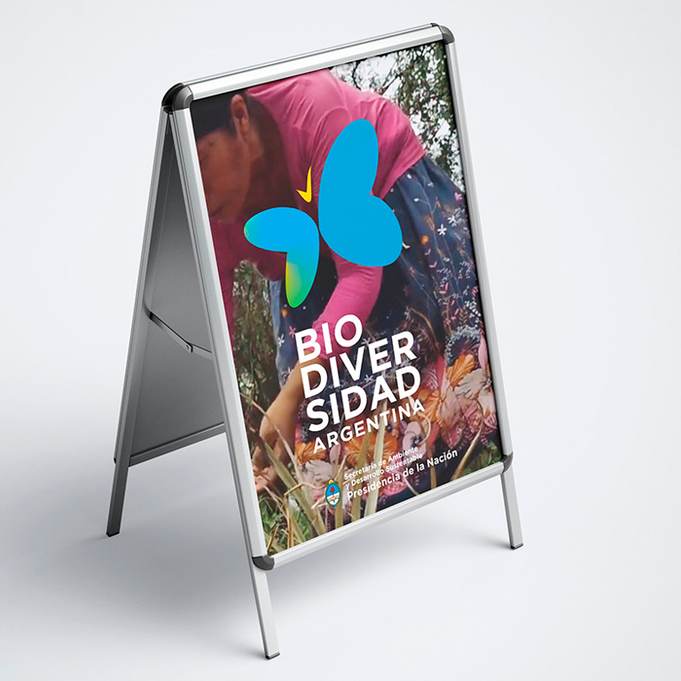
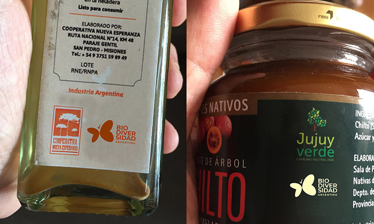
The brand designed for the “Products of Argentine biodiversity” manages to synthesize in a symbol of great impact and clarity, a sum of meanings in a synthetic and recognizable figure.
In this identity, a butterfly is first conjugated. Such insect is considered an ideal referent because of its non-productive nature (such as bees); for its emotional connection with all audiences, and as a materialization of existing diversity, since butterflies are present just when insecticides and agrochemicals are not scattered.

However, and secondly, it is not just any butterfly. Local butterflies were studied but I preferred to work with the shape of the wings so that they generate the letter B of biodiversity. Thus, we achieve accordingly a more solid distinction from the program.

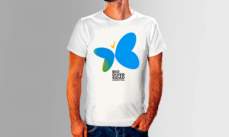
Third, the butterfly presents the features and colors of the Argentine flag, this characterization allows to show the unique way of our biodiversity, separating this from other national seals.
On the other hand, the contour of the wings forms a continuous line similar to an infinite symbol, related to the idea of sustainability over time.
Finally, the butterfly’s head has been designed so that from its gestures it is an approval mark, something useful in every guarantee seal.
