CottGroup is a Turkey-based company which offers foreign investment services, specifically for the those living in the European Union. It is a sort of umbrella company, made up of several service companies, such as: accounting, marketing, human resources, etcetera. After the interviews held in Istanbul, I presented a strategy based on reinforcing the local origin of the company–the intention being to establish the brand as the benchmark for all those who would hope to invest in or trade with Turkey. On the other hand, I wanted to highlight the excellent and efficient work that the group was currently doing for multinationals–all supported from within a cordial, reassuring, and impeccably professional environment.

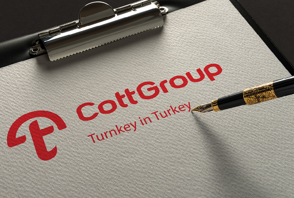
As the company had previously worked with an umbrella as the brand emblem, I planned to reinvent this symbol, establishing it as the axis for a new system of identities for all the individual companies within the network. This new system consists of an icon, a coherent naming structure, slogans, colors, and fonts. I designed a schematic umbrella symbol formed by the letter T, which is associated with the ‘@’ sign. The reason behind using the letter ‘T’ as a unifying badge is because the letter happens to be used in the majority of company names in Turkey, and is also present within the popular corporate motto: “ A turnkey in Turkey.”
This system was designed to allow for each company to have the resources to express its unique purpose, areas of expertise and exceptional qualities, without having to separate from the brand as a whole. On the other hand, the asian-influenced style to its modern typography and the red color were chosen to establish the local membership of the group.
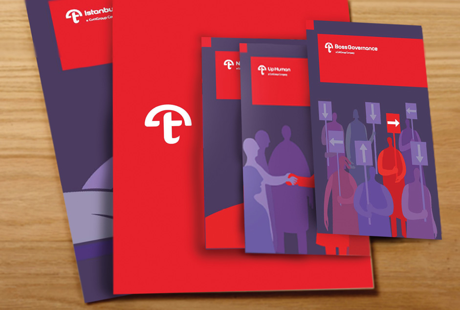
On a final note, I drew a series of illustrations to help further explain the activity of each particular company. The reason behind these artistic elements was to establish a more human touch within the brand development.


