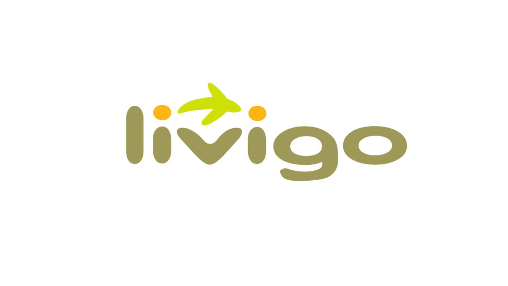
The visual identity I designed for Livigo consists of the name and a symbol. The name is represented with small caps typeface, which is pleasing to the eye and modern. The symbol speaks of the connection between the parts, reinforcing the articulation of LIVIGO through a soft and warm figure. This is created through a figure that links the two points of the “i”s in “LIVIGO”.
The significance of the figure that unites the points remits an idea which could be that of either an airplane or of a whale leaping from the water. The combination of both ideas provides LIVIGO a relationship with the subject of Air-miles without being associated solely with aircrafts. For this reason the airplane has been distorted to the point of being only be a gesture.
Furthermore, the resemblance to the whale in a state of freedom gives the brand an air of freshness, energy and spontaneity that is considered necessary to motivate the user to make “the leap to participate.”
This image contains the basis of future advertising given that it will be able to distinguish the brand, thus converting it into a message that explains LIVIGO. For example, an animation could be created that reconstructs the journey that LIVIGO makes joining two given points.
The slogan
Given the complexity of the service offered by LIVIGO, it was considered necessary to include in the design of identity a slogan to complement the logo. This slogan helps to delimit and manage the significance of the brand with regard to the specific area of action. Thus, the slogan “Bring your rewards to life” was proposed.


