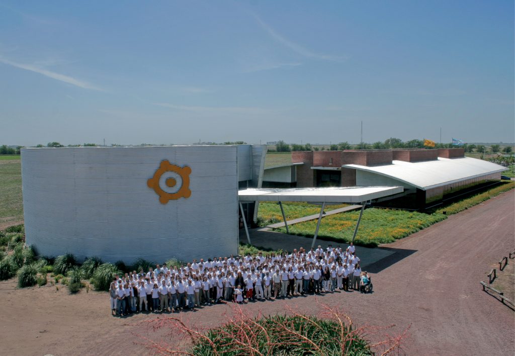
The Los Grobo Group is one of the leading producers in the agricultural industry of South America. For the brand design, I laid out a complex visual identity system, which allowed the focus to be on the agribusinesses, while also including the agricultural production industries, such as the milling industry. To achieve this, I implemented three visual resources: 1.) The color yellow/orange typical of grains and oilseeds, as well as being the atmospheric color central to the actual activity of the business; 2.) The name “Los Grobo”, representing the established presence of the name with a modern and dynamic twist; 3.) An abstract symbol (perhaps the most important of them all), which reflects the true spirit of the company.
“The image designed by Guerrini has turned into the icon that propelled the company and expressed its potential”
- Gustavo Grobocopatel
- Los Grobo Group – Director
The desired interpretation of this symbol by the observer, was revealed through related activities: spontaneously emerging associations with the sun, sunflowers, corns, gears or meeting places, which allowed us to obtain a visually attractive point of relation and integration. The indigenous style of the symbol was inspired by the Tehuelches paintings of the La Pampa area–the company’s place of origin. This stylistic choice was proposed in order to represent the company family owner’s roots, allegiance, and commitment to his native home.

The visual identity was applied to various promotional materials, achieving a sense of empowerment, scale, territoriality and thematic range. As a consequence, the Los Grobo group’s visual presence widely expanded locally as well as globally; and has continued to do so in a sustainable and consistent manner, all this in a market where the image of a brand is its defining factor.

