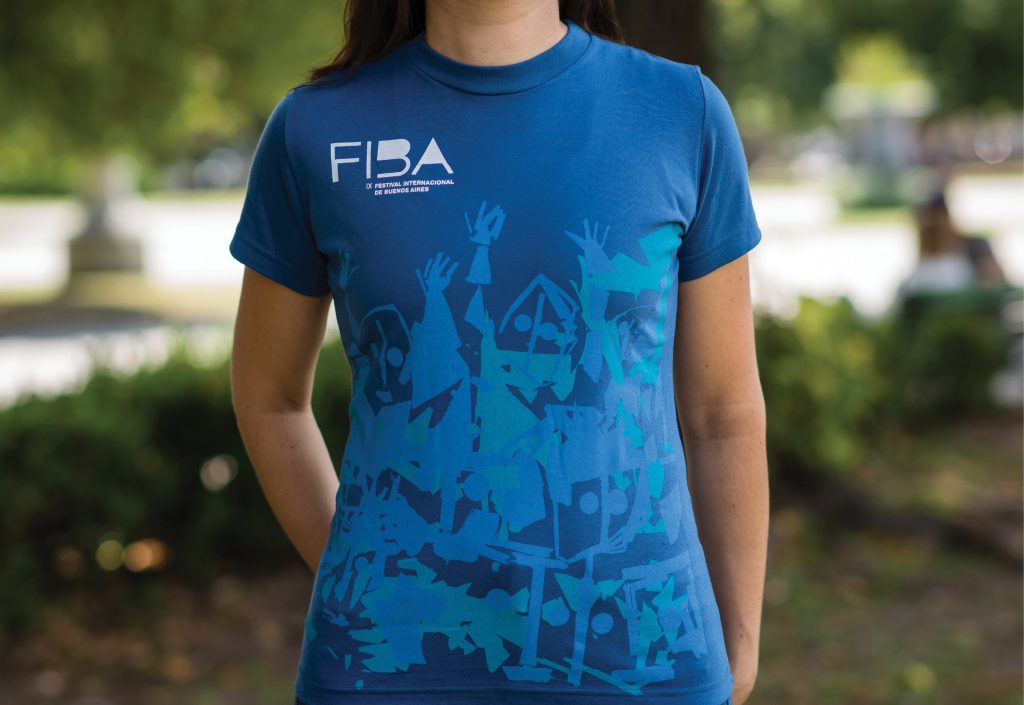
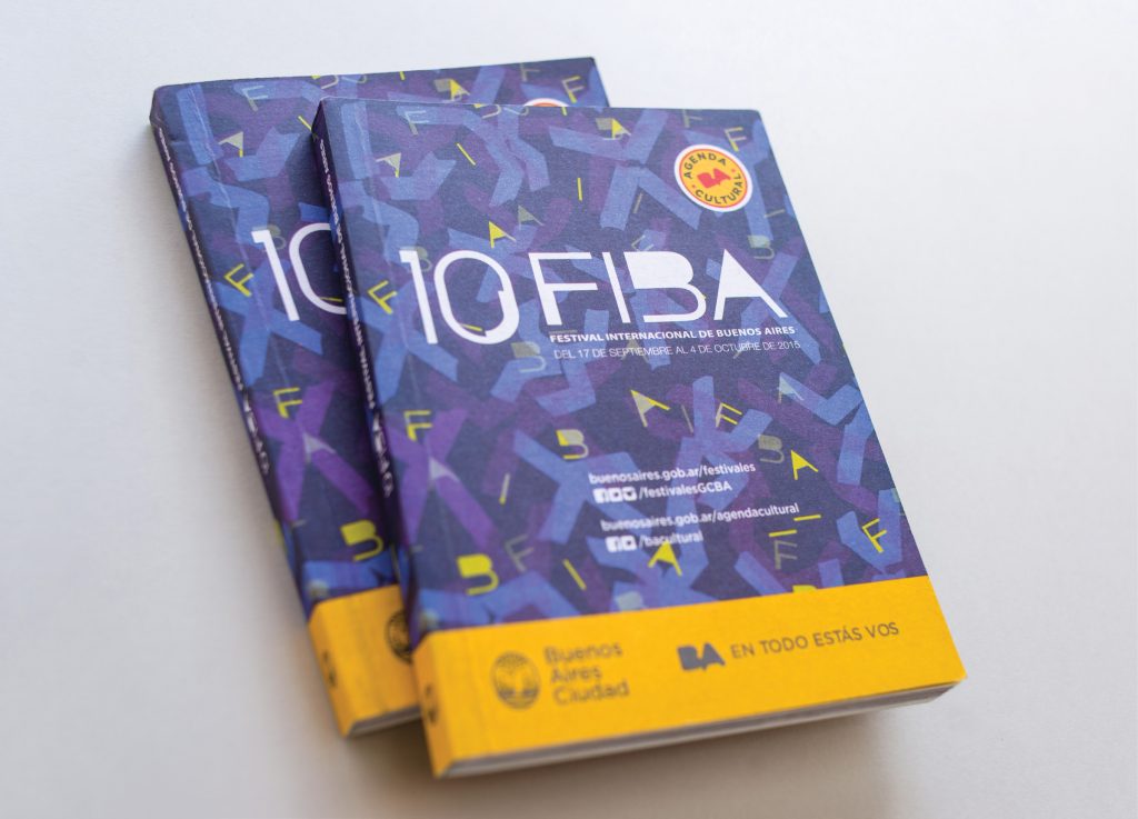
After the VII International Festival of Buenos Aires I was hired to design the image of the following three annual editions – the only restriction was that the identities had to correlate with the other festivals organized by the city government, which had already chosen the FIBA’s trademark color blue as their unifying element. The intention was to establish a more traditional visual identity so that the brand would have continuity and greater institutional presence. Also taken into consideration was the fact that the festival’s program would include groups from all over the world, many of which were internationally renowned; for this reason, it was considered best that the visual identity and overall image of the festival not compete figuratively with these identities, but instead help to integrate and bring cohesiveness.
The result was a simple brand design, much less expressive than the previous one. This time, the typography and chromatic range played principal roles, and it was the background images which gave each festival its personality. That is, the unique aspects of each festival are now expressed through background textures, which were developed for each edition. For this setup, the images from the VIII festival (2011) were abstractions from explosions and ruptures; those from the IX edition showed the natural beauty of age spots, and those of the X edition were made up of a guard I had created from making paper tape drawings, based on seeing the X as a human body.


